What to Wear for Family Photos
Choosing The Right Colors
Dress colour theme
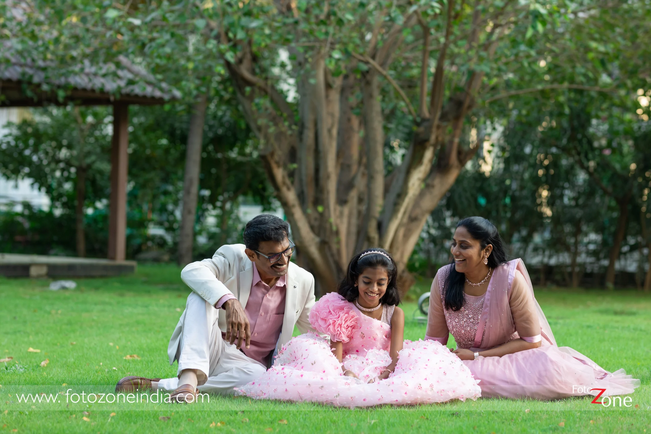
When planning a family group photo, maintaining a consistent colour tone is key to creating a stunning and visually appealing image. If you prefer dark-coloured clothing, ensure that everyone follows the same tone. Mixing light and dark shades in a group photo can disrupt the harmony and balance of the photograph. Coordinated outfits bring out the best in family portraits!
What to not wear for a family photo
For a family photo, it’s best to avoid:
- Clashing Colors & Patterns – Neon, overly bright colours, and busy patterns can be distracting.
- Logos & Text – Clothing with big logos, brand names, or slogans can date the photo and pull focus
- All-White or All-Black – These can make you look washed out or lose detail in photos. Instead, mix in some textures and soft colours.
- Too Trendy or Seasonal Outfits – Ultra-trendy styles might look outdated quickly. Avoid obvious seasonal prints (like Christmas sweaters) unless it’s a themed shoot.
- Clothing That Doesn’t Fit Well – Too tight or too loose outfits can look unflattering. Wear well-fitted,
comfortable clothes. - Uncomfortable Shoes – Especially for outdoor shoots, avoid high heels or shoes you can’t walk in comfortably.
- Matching Too Much – Instead of identical outfits, aim for a colour palette that complements each other.
Choose What to wear
Solid Colors
Wearing solid colour outfits for a family photoshoot is a great choice! Solid colours help create a timeless and cohesive look, keeping the focus on expressions and emotions rather than distracting patterns.
Here are some tips for selecting the right solid colours:
1. Choose a Color Palette
- Neutral Tones: Beige, white, grey, navy, or soft pastels create an elegant and classic look.